“There is a logic of colors and it is only this, and not the logic of the mind, that should guide a painter”
Paul Cézanne
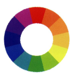
At art high school, the circle of colors (see below) is made with a rapidograph (satanic device!) and with a special adhesive tape. The task has two basic goals: it teaches combining colors and precision. This is one of those exercises during which a man learns to curse.
My teachers of the time: Ms. Alicja Waloszek and Mr. Piotr Kwaśny were not satisfied with the circle of colors made for the C grade. Each of us had to achieve the championship! Colors could not overlap each other, and each of them was to be placed evenly and neatly, without smudges or streaks. What’s more, the drawing was supposed to be round, but using the compass was not an option …
Why do I remember school times? I want to show you how much the composing of interior and image have in common. And how you can, without going through the torment of creating a circle of colors, use them in arranging your interior.
Harmony, background and ACCENT count in composing. In painting, lemon is often used for the accent role. Because it has a distinct color and is small (smaller than a pot or roll of toilet paper). To have a well-composed interior, think about what element could be in the role of a lemon in your home? It’s the icing on the cake. Final touch. The lemon can be one – bigger, you can also use several smaller ones:

The accent can be delicate, like here, in the form of wood and beige:

A tip for you: look at the color circle above, choose 2-3 colors next to each other, on which you will build the color of your interior (complementary colors), now see which color is opposite them, it’s your color accent built on the principle of contrast. You can also arrange the entire interior in the predominance of one color, and one of the complementary colors will appear as an accent. And they do not have to be strong shades, pastels will also cope with the principle of accent.
Very often the accent coincides with the “wow” effect. The eye runs towards it. Decide what should attract your and your guests’ eyes. And it does not have to be a color, the structure or texture will work as well. For example, an old, decorative tile stove against a smooth wall of the same color. The general rule is that in order to be able to call something an accent, it must appear in a definnite minority.
A separate topic is how to choose colors for yourself. Your beauty and character and how a given color affects our psyche. Intrigued? I will write about it soon.
Ciao and servus!
Kika.
PS If you do not want to miss KIKI letters with tips on how to decorate a beautiful interior, subscribe to the newsletter.